Defining brand values
Before addressing any visuals, I wanted to ensure the team was aligned on our internal and external brand values. After running a survey internally with the team, it was clear that we were aligned. Our current brand was safe, supportive, and informative. I also interviewed some of our customers, and after some iteration with the team, we landed on the following brand values:
- Real: We recognize the messy parts of life and don't try to hide our truth
- Playful: We find humor and levity in all parenting moments, even the difficult ones
- Expert-based: We use data, evidence, and expert experience to provide guidance and support
- Communal: Everyone can join in and feel supported here
- Respectful: We believe everyone deserves to be validated and seen
Competitive analysis
I looked at competitors, and they generally fell within 3 themes: Earthy, Kid-friendly, and feminine. I wanted to take elements of all of these, but wanted to ensure our brand stood out from the others.

Initial visual explorations
With brand values and competitors in mind, I initially explored 4 directions: Real, Playful, expert-based, and communal

After reviewing with the team, we agreed that expert felt too clinical. The product was supplemental (not a brick & mortar clinic) and we didn't want to give the wrong impression there. We also didn't want to go with playful, as we wanted to focus on parents, not kids. We decided to iterate more on communal and real directions with a few changes:
- The "real" direction felt too calm and meditative. The colors needed a boost.
- The "communal" direction needed a whole new iteration. The colors and imagery weren't working, so I needed to come up with a new concept.
Second explorations

I had an idea to explore the concept of a thread tying everyone together for the second version of communal. I stuck with earthy, organic colors and a pop of trustworthy blue

For the second iteration of Real, I explored more vibrant colors to give it more energy, while keeping the meditation stone shapes and realistic imagery.

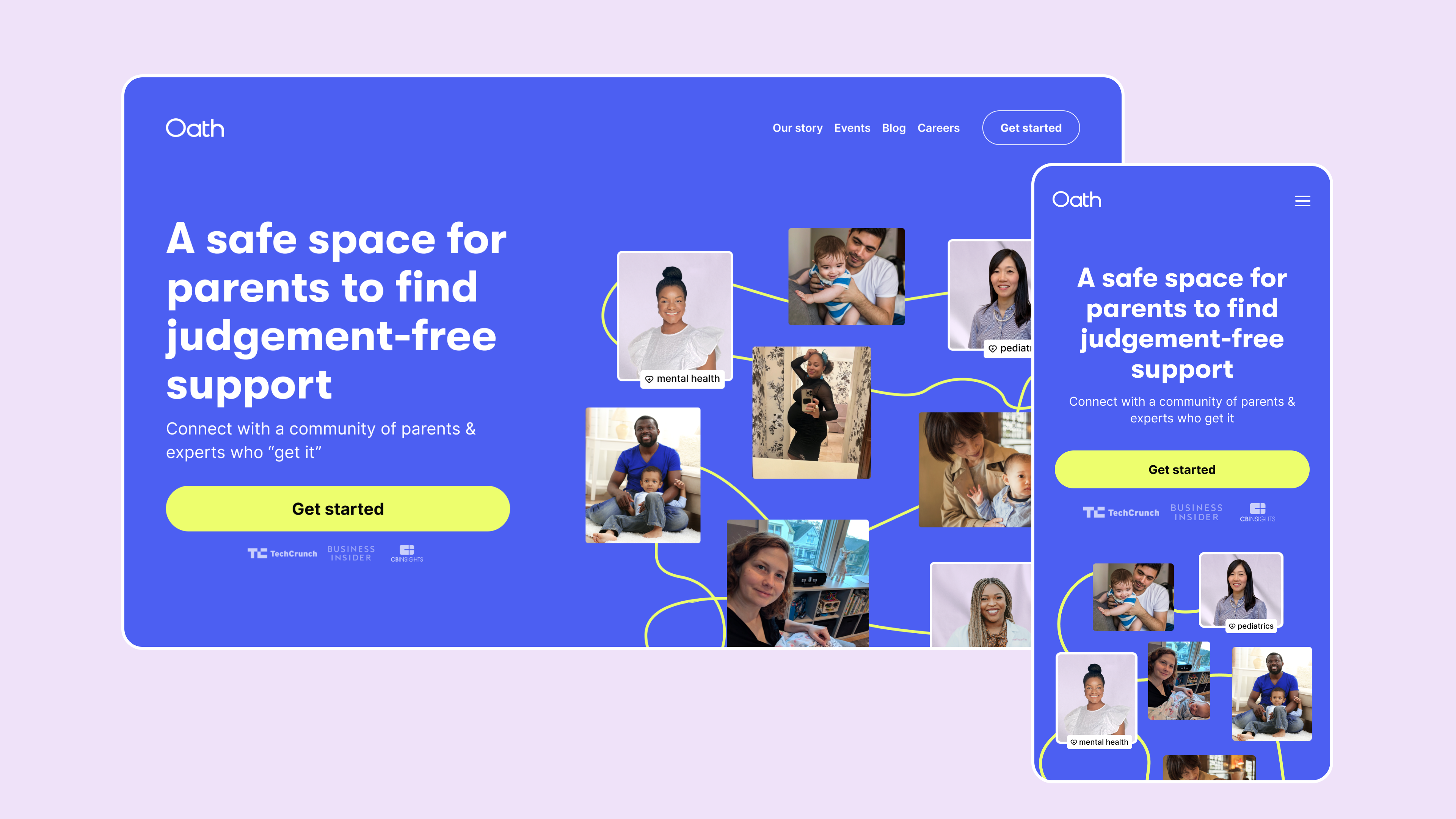
The final direction had elements of the communal graphic but with a more refined and smoothed out thread. I took our existing brand blue and brightened it while still keeping it accessible. I also kept a calming lilac color as well as a lemon that made our CTA stand out and felt playful. I love how the movement of the "squiggle" as we called it felt ownable.

I chose GT Walsheim as a chunky, playful display font. Because I knew our brand would have to flex into app, web, and marketing materials, I chose a really flexible font, inter, for our paragraph typeface. I also gave our specialists a special lilac wet paper background so that they were differentiated in both our app community and in our marketing materials
Measuring results
Though the team loved the final direction, we still wanted to validate that our customers would love it. We put out a brand survey measuring the 3 new directions against our existing brand. Our final direction scored much higher on appeal and likelihood to join. The team was excited to start working with it, so we started implementing it into our marketing channels and product.
Establishing brand guidelines
I created brand guidelines for the team to follow, including dos and don'ts as well as downloadable templates and assets. This helped our marketing team level up and unblocked them from shipping to all of our marketing channels

Refreshing marketing channels
I designed a new marketing site and worked with engineers to ship it. The team developed new creative for Instagram, paid ads, and app store, which felt more consistent and visually worked well together.

Integrating into the product
I worked with engineers to replace the type in the app, and then the colors. Since I was designing the product experience as well, we strategically stripped away some of the old brand elements as we shipped new features.


Alongside all the product changes, I built out the design system. This helped us move really quickly since we could just plug in reusable components.
Building a design system for a larger design team is not the same as building for a startup. I mad a rule that I had to use a component 3 times before we built it into the system. Any less than that and it was too much upfront cost for a fast-paced team.

Results & learnings
Ultimately, I'm glad we refreshed the brand. The project stretched me creatively, but it also brought energy to the team. The marketing team was excited to use the new brand, and it showed in the new assets they created. We also saw a big increase in non-birthing parents, and this effort supported that.

