In December 2021, we launched a newly branded design system.
We designed core foundations, components, and patterns. We also established new processes for contributing to the system, educational workshops, and templates for design presentations and other artifacts. I personally built 10+ core components, established an accessible type & color system, planned and led educational workshops, and rolled out the system with the engineers on the team.
The system is used by all designers and engineers today, and has enabled the team to move much faster in delivering products.
There were a few reasons we decided to revamp the design system.
Our brand team started out by developing some brand guidelines and attributes. We landed on the following key themes, which helped guide the visual style:
- Neighborly
- Knowledgeable
- Straightforward
They then came up with 2 concepts to test with customers. One concept, Renzo, was more refined, architectural, and elegant. The other, Eero, was more curvy, colorful, and fun.

Eero
After testing with customers and sharing the brand vision with some key stakeholders, we decided to go with the fun version (eero). This became the visual direction for the whole project.

Design sprint
With the visual direction established from the brand team, we held a design sprint to gather all the ideas and explorations. We took 3 screens from the core experience, pulling from app and web to ensure we were building consistency across both. Each day, we explored different parts of the system and iterated on components as we went. As we'd review designs each day, we started solidifying some principles.

Principles

As we gravitated towards different design styles, we developed principles that would guide our later designs. We did an extensive audit of our current product and found many inconsistencies and a lot of variance in usage patterns. We wanted to simplify as much as possible without becoming boring.
Old and new
We iterated and landed on a few example mocks to highlight the new styles and make sure our concepts would work in our most commonly used screens.

In the new style, we removed a lot of the decorative elements and streamlined to add more white space. We wanted to ensure each screen adhered to our principle of "one magic per moment."
We moved away from lighter text and subtler colors into bold black with scannable, chunky text.

Foundations

Using the north star mocks we developed, we narrowed in first on a core type and color set. We decided to keep our current typeface, but added bolder, more robust headers and created type pairings for other designers to use.
With the color palette, we removed a lot of the lighter and inaccessible colors in favor of bolder colors. We also pared it down quite a bit to allow for single pops of color and more imagery over illustration. We wanted the color palette to be streamlined and bold, and we wanted there to be less confusion about which colors were accessible.
We also developed a spacing system that would work with all components, using 8 as a base and stacking spacing with type where we could.
Components

Once we had solidified our foundational elements, we began working on components. We created button and link styles, form elements, toasts and notifications, cards, and other commonly used components. We used the following process to design and implement each component:
- An audit of where the component was being used in the current product and designs + competitive analysis of where the component is most commonly used in other products
- A definition of what the component was and wasn't (i.e. this is a toast, not a push notification) and requirements listing all the different states of the component we needed to solve for
- Explorations of different visual styles and treatments followed by a design review with the design team including designers who planned to use the new component
- Documentation and implementation with engineers

Socializing and educating
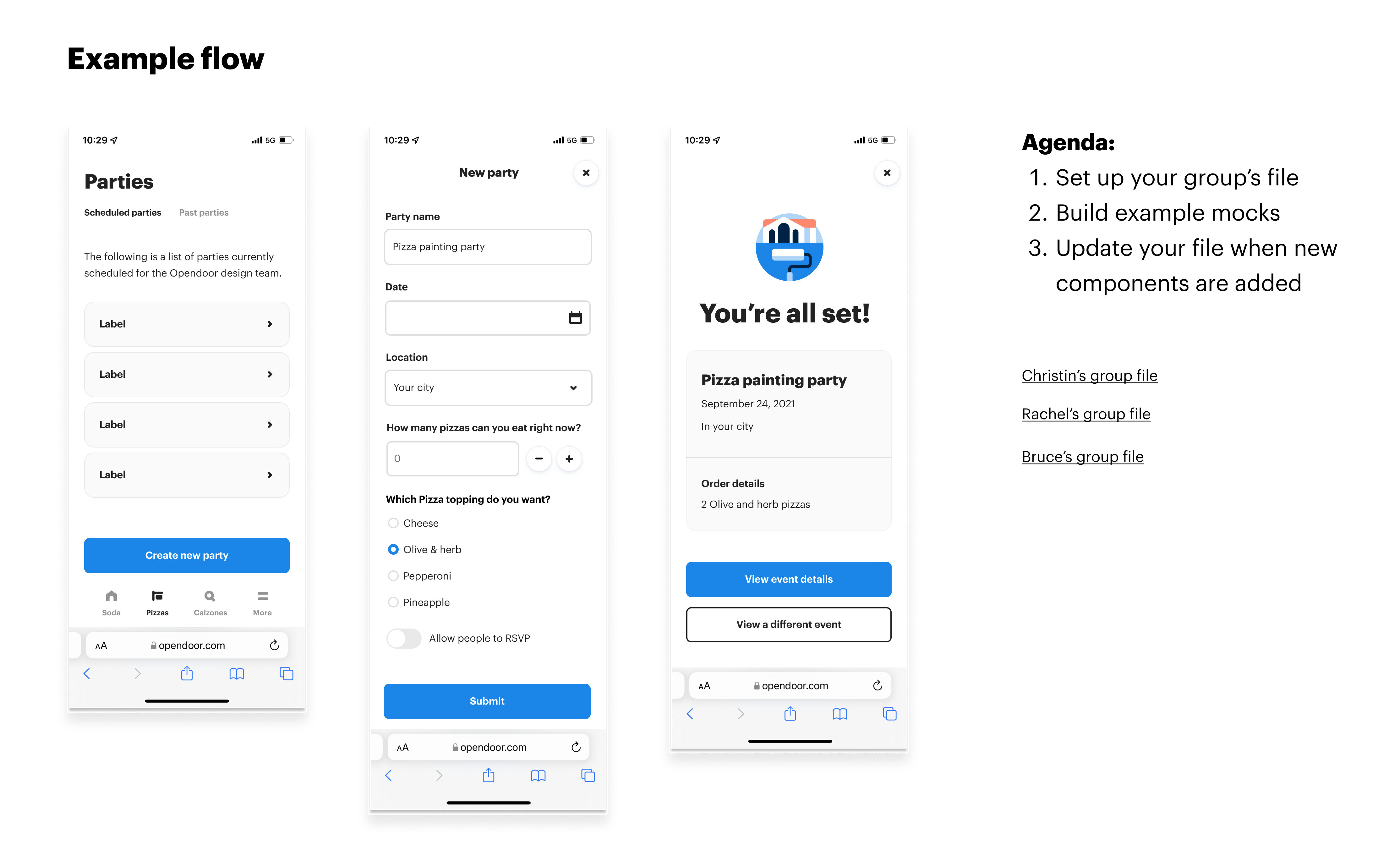
We believed that the design system should be a living system. We wanted to ensure other designers felt confident and comfortable contributing to the system. We also wanted to understand what was and wasn't working with the system so that we could iterate on it. We held a workshop to let other designers play around with the system and to get feedback on what was & wasn't working. We developed some mocks and had all the designers build them with breakout groups that people could ask questions in.
Results

We shipped the new brand and design system in Fall 2021. It was launched with our new combined buying and selling product, Opendoor complete. We shipped over 20 components and created consistency between naming conventions in the code and Figma file. The system is used by all designers and designers from each team actively refine and contribute to the system.